We’re all about the cool stuff users see. But hey, sometimes we forget to check if errors can mess with the smooth user experience flow in design.
Who wouldn’t be happy about a smooth flow while using apps? It’s like cruising without hitting traffic jam on your trip.
The smoother the trip, the happier we get. It lets us cool off and think about what we’re gonna do at our destination, sticking to the plan.
Like any trip, we never know what we will face — problems that cannot be controlled, such as damaged roads, renovations, or even road closures that prevent us from passing through.
So, what if this happens and is experienced by the user when using an application that we have designed well? How do we keep users happy and moving through the flow we’ve set up for them?
Prepping for The Everything
Let’s make a plan. Imagine all the possible errors that might come up. Put ourself in the shoes of a user — that’s our role as a designer. There’s nothing wrong with being prepared; it’s better to be safe than sorry. Numerous possible errors may occur.
Here are some little tips to help you address the most common error issues:
• Join The Empathy Game
Throw errors when necessary. Up your empathy score. Let’s not stress users out with just traditional bold and red colour. Sure, they indicate a problem, but what’s wrong with making it a bit softer?
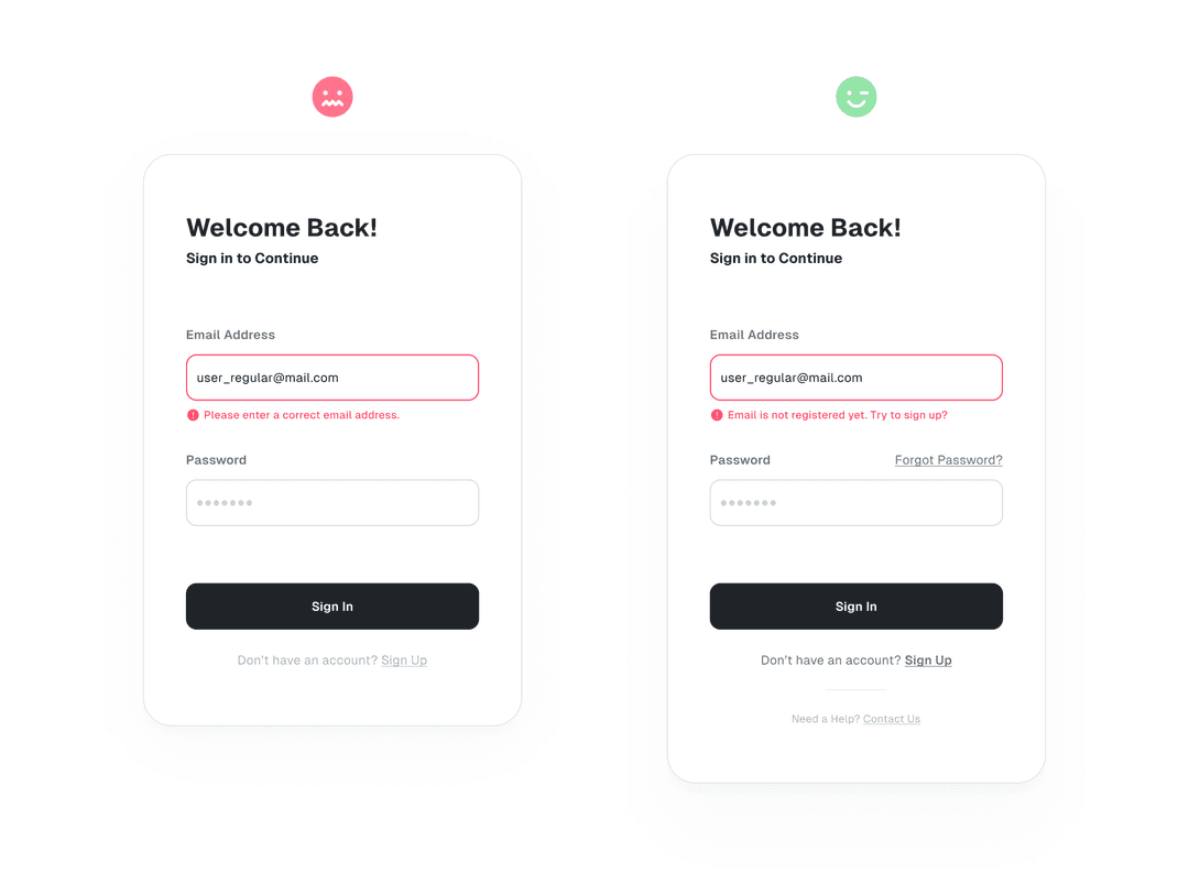
For example, if a user enters their email data incorrectly while trying to sign in, instead of just showing a red border, provide a hint about the reason for the error. This way, the user knows what to do to resolve it.
Also, give them a hand. Some users might not nail the solution right away.
Just remember, errors aren’t necessarily what the user wants; they’re a result of the design we created. We gotta take responsibility for what went down. So, one more time, up your empathy score.
• Use Good Copy, Steer Clear of Being Judgmental
Alright, let’s dive into the next game: hospitality. Just like a service pro, as a designer, you gotta rock those communication skills. When things go haywire, one cool way to chat with users is through messages. Straightforward but with depth.
Imagine you’re in the mood for a burger, thinking of adding some cheesy topping. But then, the seller comes back with a response like this:
“We’re out of cheese.”
or
“Hey, the topping you want is super popular today, and we’re all out. How about going for something else? I recommend adding meat, and it’s discounted today!”
Which one’s more fun? Honestly, as a buyer, you’d dig the second response. There, you get the reason and the fix all in one go. Even if the seller doesn’t straight-up say sorry, you get it — things happen, and it’s all cool.
Maybe we can give an example of a copywriting error, like this one:
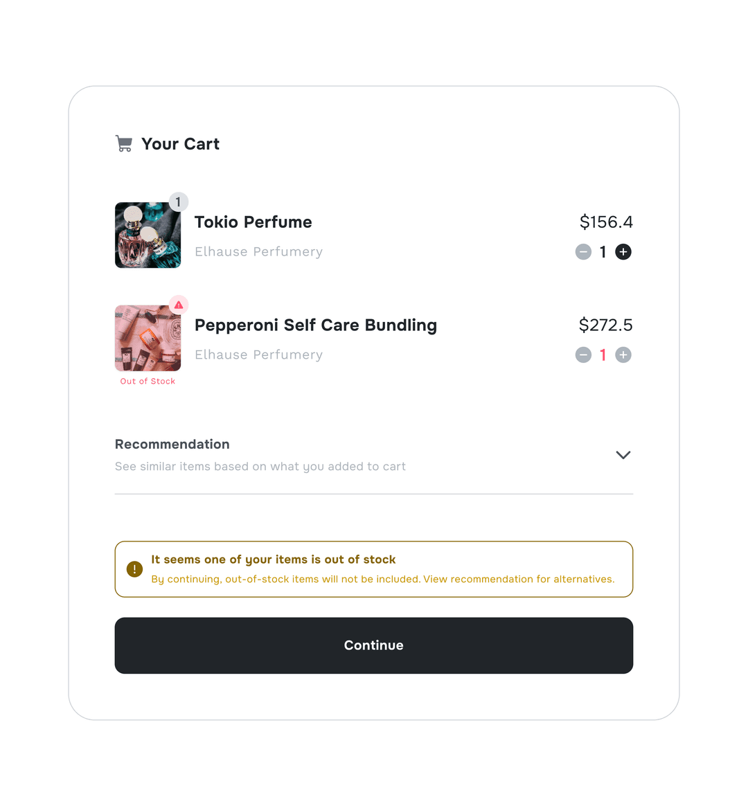
Use the right tricks for writing stuff that users will get. If you write too much, it can confused and your ‘good copy’ won’t make sense to them.
Use simple language that everyone can get. Skip the fancy tech talk.
The quicker users get it, the sooner they’ll cruise through to the next happy step. This shows how well you can coolly deal in with what you write.
• Communicating With The Team
When it comes to handling errors, designers might not know everything. That’s why it’s cool to talk with the team, especially the devs, ’cause there’s tech stuff that goes beyond design.
To tackle this, try coming up with some questions that could serve as a reference when communicating with developers:
Is there a potential technical error outside the flow?
Why is this error happening?
What’s the quickest technical solution to maintain a smooth user flow?
When will this technical error pop up?
What’s the severity level of the error that might suddenly appear in this flow?
By structuring a pattern of questions like this, we can figure out the preparatory steps to keep users on a happy path.
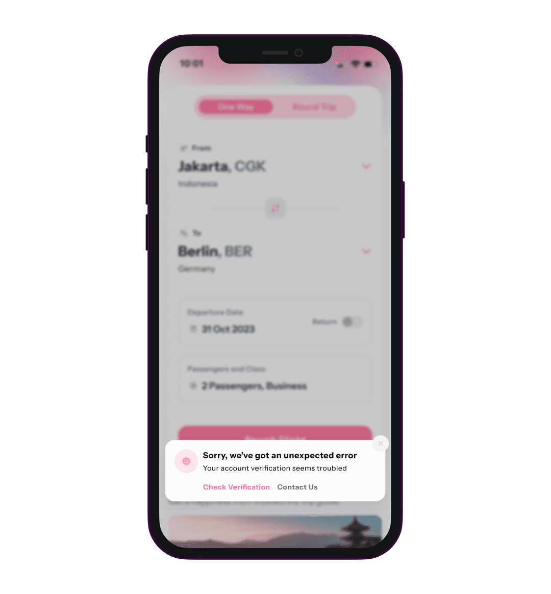
If the question isn’t answered properly, as a precaution, insert a call-to-action where users can contact customer service directly or visit the FAQ page. Which can guide them regarding the error they are facing.
Business Spice
Errors are a real bummer and can mess with our business goals at design. However, in such cases, we can still incorporate alternative options to ensure the flow remains enjoyable, even if it slightly shifts the business objective.
— In some everyday situations, like, say, hitting a 404 page — yeah, that’s the one telling you the original page you were after is gone. Lots of designers throw in various cool illustrations here. And, you’ll probably spot a button to bounce back to the main page or the previous one.
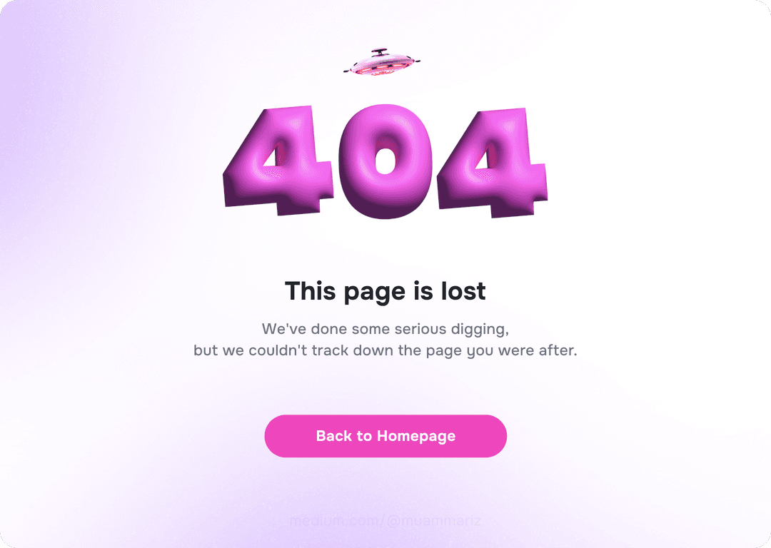
There are tons of ways to link it to business. The secret sauce for dealing with errors is simple: ‘Don’t let a user get stuck or bounce around in a flow just because of some error.’
Instead of just slapping buttons and illustration, how about we showcase what we’ve got? Throw in some cool suggestions or tempting vouchers (especially if it’s an e-commerce thing).
At least, the clicks-rate on a product from a 404 page can open up a new decision flow that we can tweak and play around with.
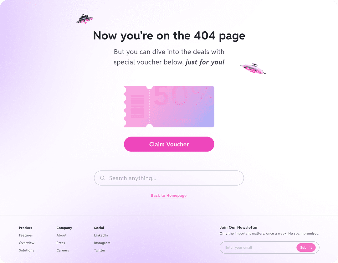
In this scenario, we gotta chat with the folks tied to the business, you know? Check if there’s a chance to amp up the value of the offer in a few existing hiccups.
Naturally, start by breaking down the goals and conditions in the current setup. So, our business goals stay in sync with the design vibe we’re throwing together.
When a design works, nobody notices. But when it breaks, everyone’s on a blame hunt, sniffing out the problem. Turn error hiccups into support for our design’s mojo.
Have a good time playing and diving into the “error” game!

